3. Building Custom Reports
Last updated: June 11, 2026
Building custom, on-demand reports to monitor referral and admission trends
The report builder is your workspace for analyzing referral data.
See the Dashboard Overview article to learn about the types of pre-built reports exacare offers and the Exporting and Deliveries article to learn how to effectively use the data center (e.g., scheduling reports, downloading files, using filters).
The Advanced Report Builder empowers you to:
Quickly analyze referral and admission data
Create custom reports with drag-and-drop simplicity
Gain insights into referral sources, acceptance rates, and performance metrics
Visualize data across different dimensions like time, source, and status
You can easily build reports to answer questions like:
Which referral sources generate the most leads?
What is our referral acceptance rate by hospital?
How do win rates vary across different sources?
How to Access the Custom Report Builder?
Log into exacare and Navigate to the Data Center
In the top left corner of your screen, select "Custom Reports"
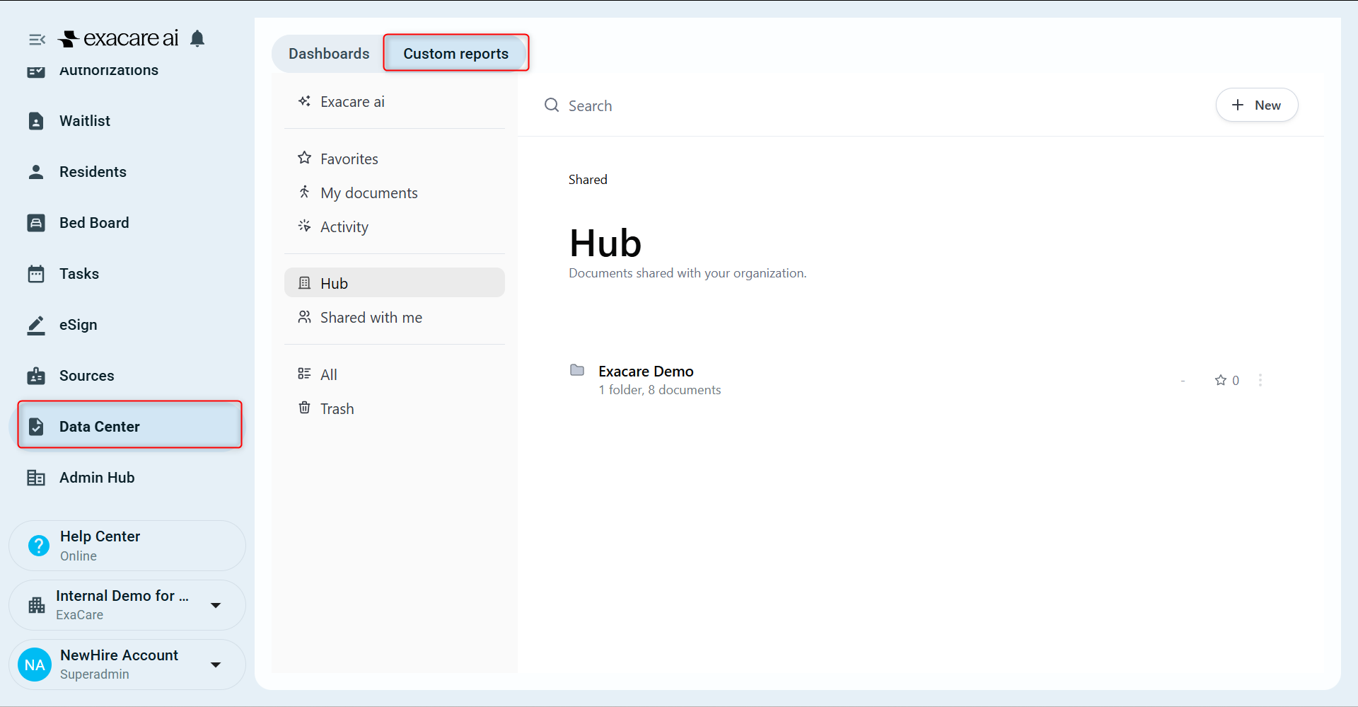
Click into your organizations folder to view the custom reports
Building reports with our AI assistant
Our AI assistant helps you explore your data by simply asking questions in natural language. Just ask, and it will generate a report you can adjust and refine. From there, you can edit or customize the report as needed, saving time and reducing the guesswork of building from scratch.
You can access the AI assistant by either selecting the AI helper button on the left hand side or when you start a new brand query, you can ask directly in the body of the workbook
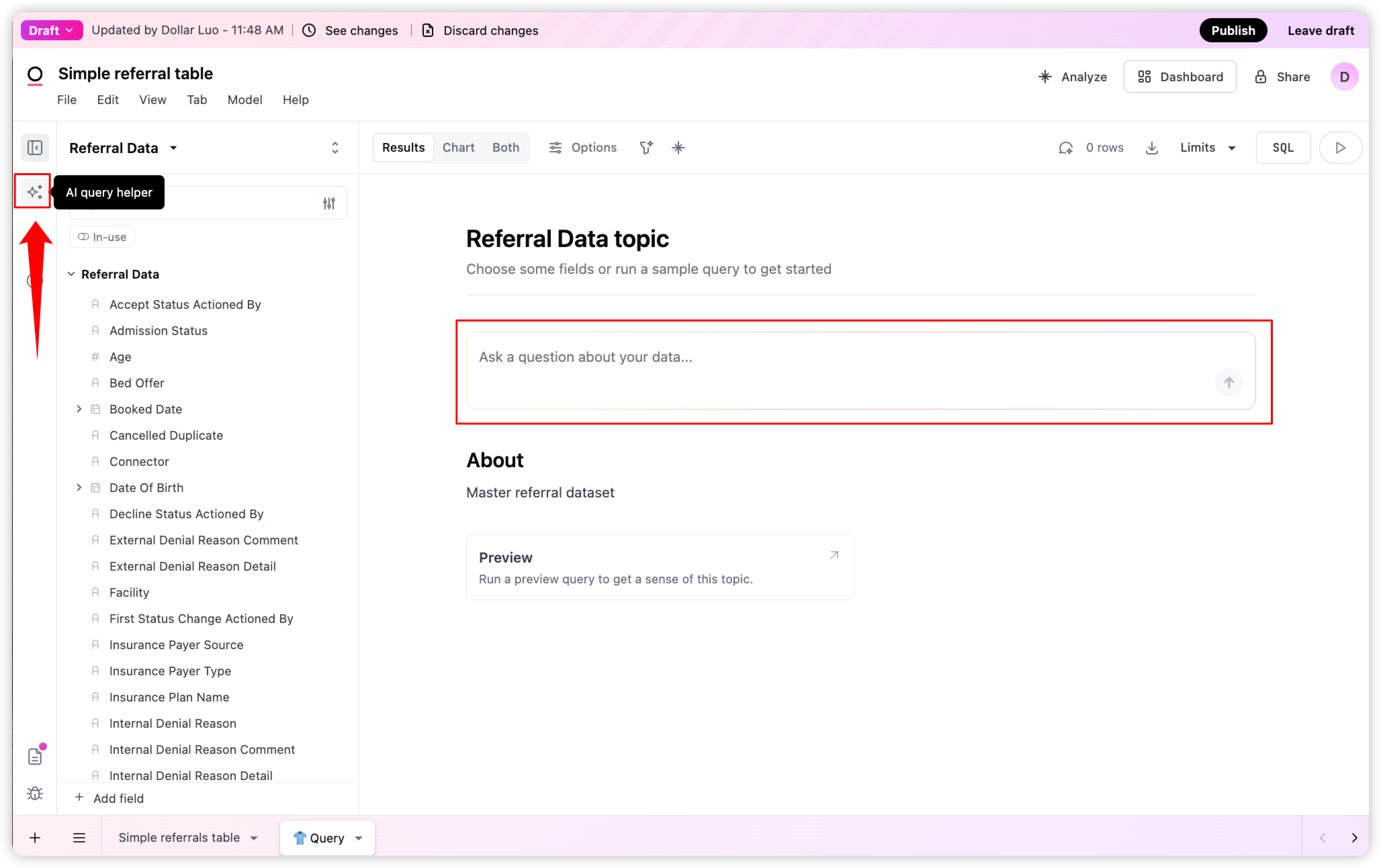
You can ask a question by typing in the text box. The assitant will automatically generate the query for you. You can also clarify your request, ask follow up questions and more.
eHere are some examples of questions you can ask:
Referral volume and performance insights:
How many referrals were received this month?
What is the current win rate for referrals?
How does this month's win rate compare to previous months?
How many referrals were accepted versus declined?
What are the most common reasons for referral declines?
Demographic and patient insights:
What are the most common referral sources?
What are the most common payer types?
How do insurance payer types impact referral acceptance rates?
Building Your Own Custom Reports:
Below is a step-by-step guide on how to create a basic report and understand the key features available to you.
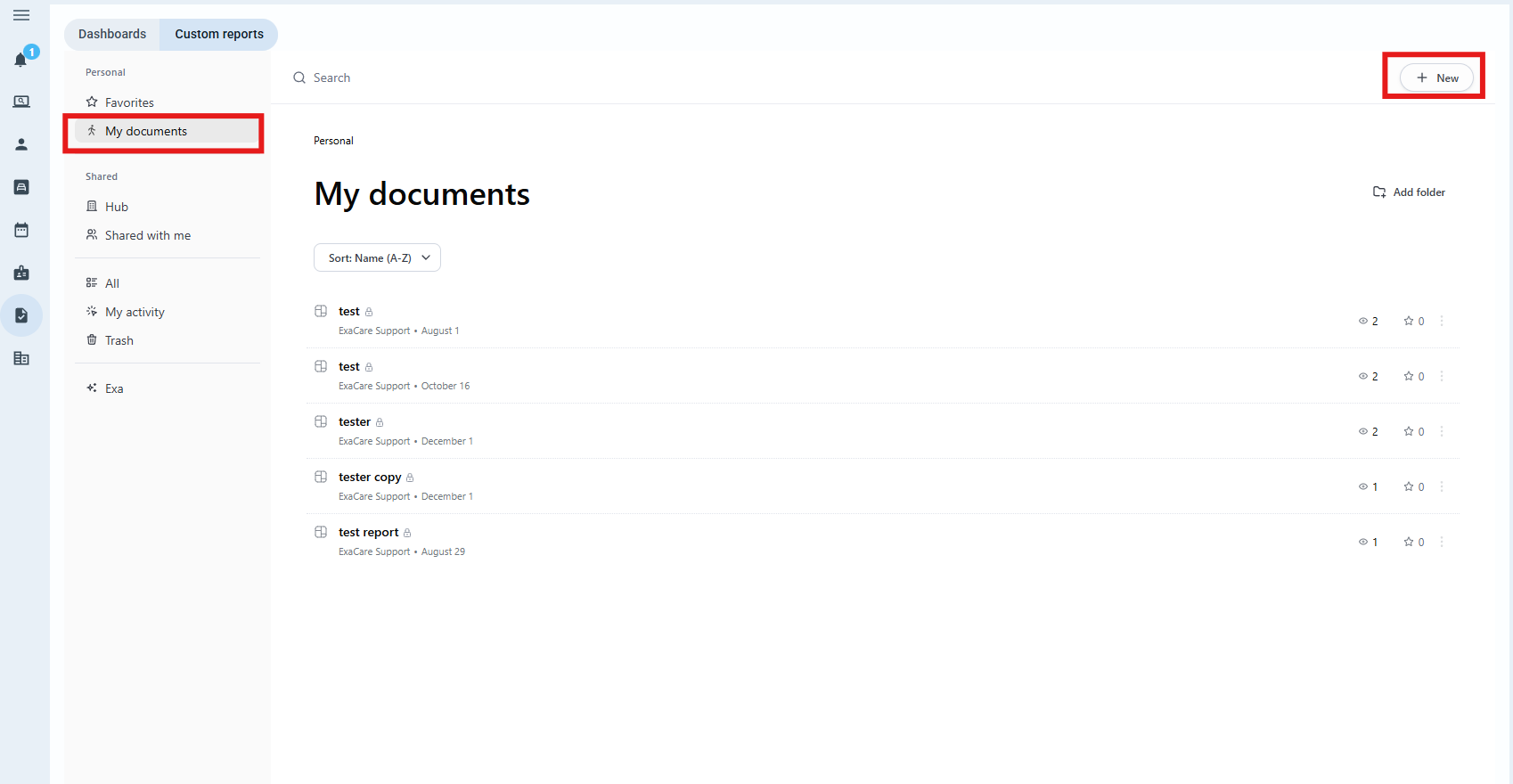
To create a custom report, first navigate to the Advanced Report Builder, then go to My documents, then select "New"
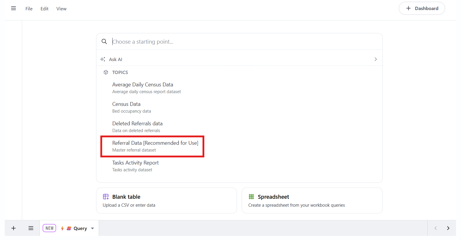
Next, select the Referral Data dataset. This is the master dataset containing all information about your referrals
Understand the workbook layout and select fields
This is the main workbook screen where you’ll build your report. On the left-hand side, you’ll see the full list of fields available for your analysis. These fields come from your master referral dataset. You can scroll or use the search bar at the top to find a specific field.
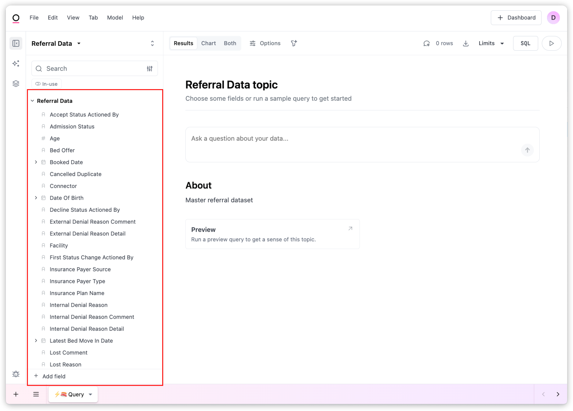
To start building your table, select the following fields by clicking on each one. As you select each field, they will automatically appear in the results panel on the right.
Test Your Learning!
Let's create a simple table that shows all referrals with their received date, source name, insurance payer type and review stage.
To do this, start by selecting each field you want in your table by searching for it in the left hand side field list.
Fields to add:
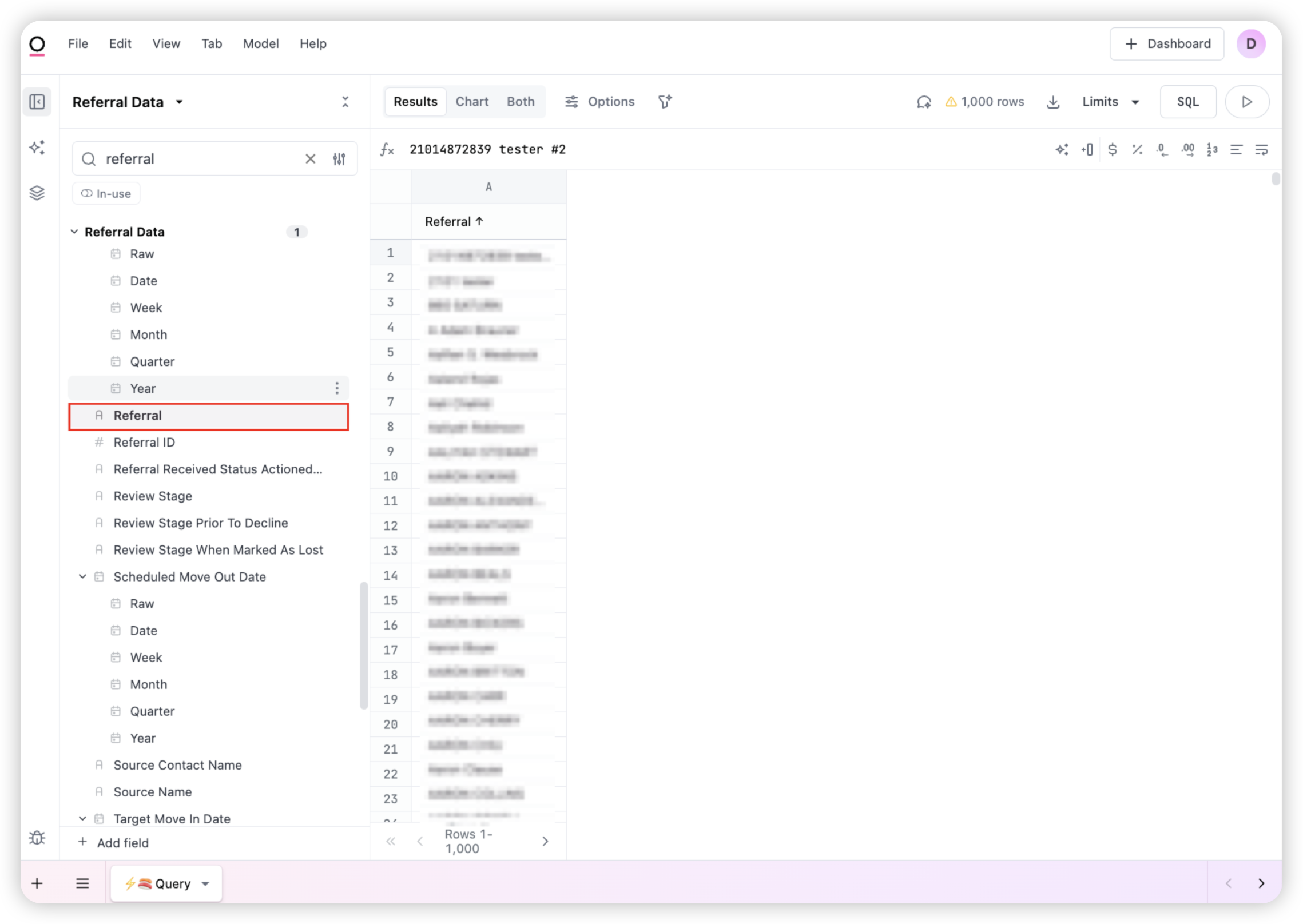
Referral – the name of the individual referral (After searching for it, you may need to scroll to find this field)
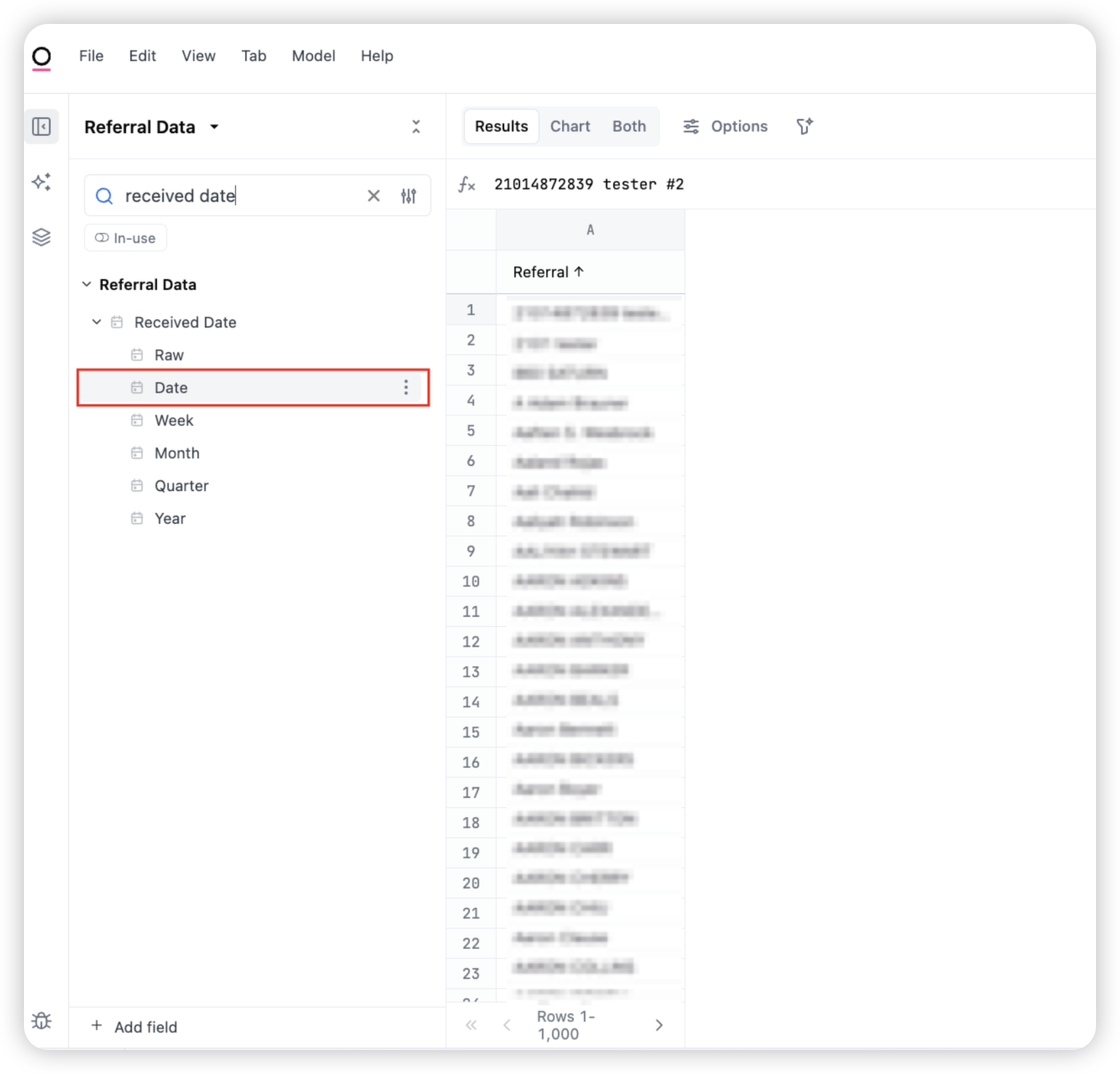
Received Date – the date the referral was received
Facility - the facility the referral was sent to
Source Name – where the referral came from (e.g., hospital, care partner)
Insurance Payer Type – the payer category (e.g., Medicare, Medicaid)
Review Stage – the current review status of the referral
You will now see all the fields you selected appear in the right hand side results section.
After selecting your fields, toggle the In-use filter on. This view shows only the fields currently used in your table. It’s a great way to keep your workspace organized and quickly review what’s included in your query.
Pro tip: You can drag the column title to change the order of the columns
Removing fields:
To remove a field, simply select the field again on the left hand side and it will be removed from your table
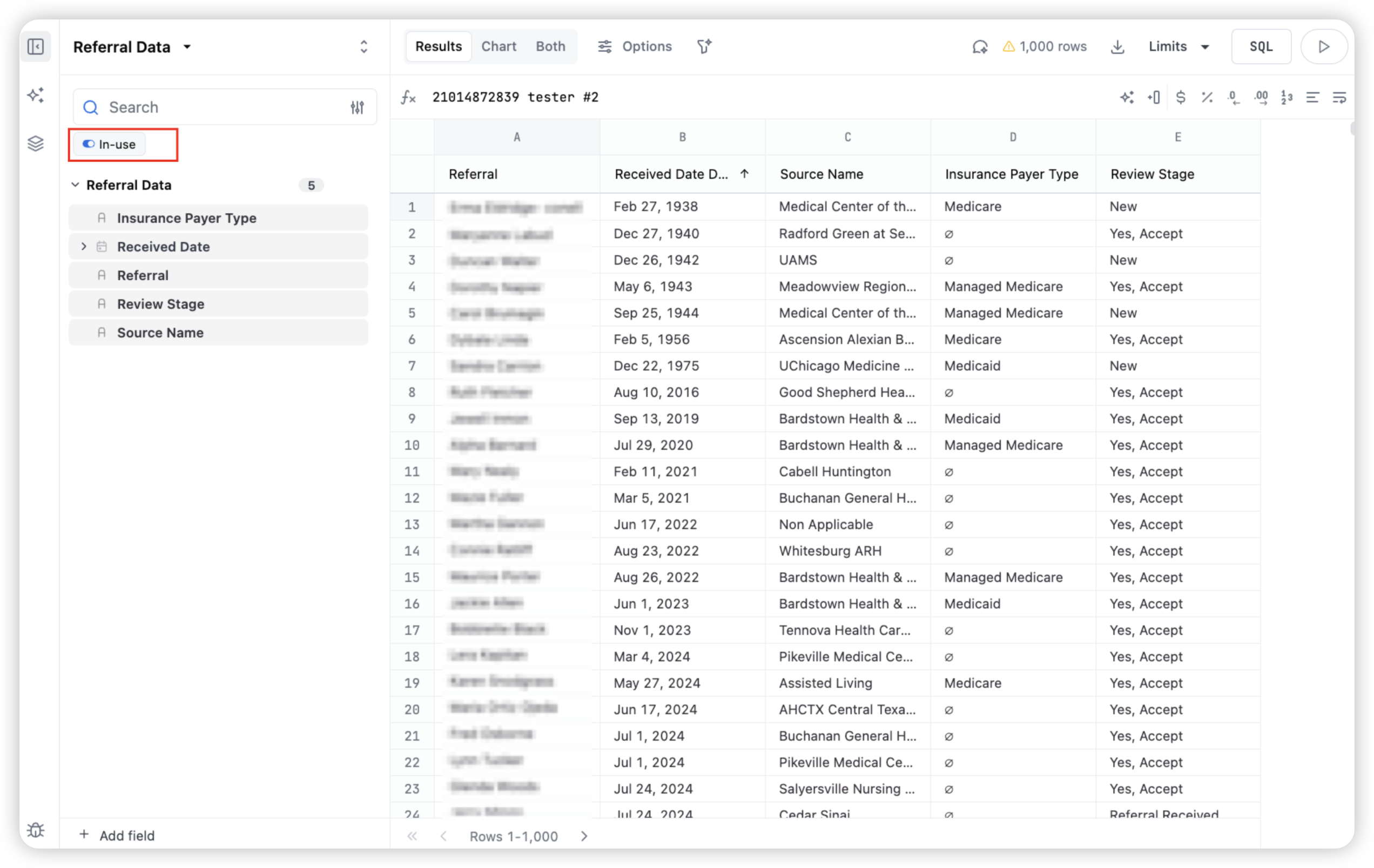
By default, you’re in the Results pane. This displays the raw data behind your analysis. Think of it as your starting point—showing the fields you’ve selected (e.g., referral name, received date, source, insurance payer type, and review stage) in table format.
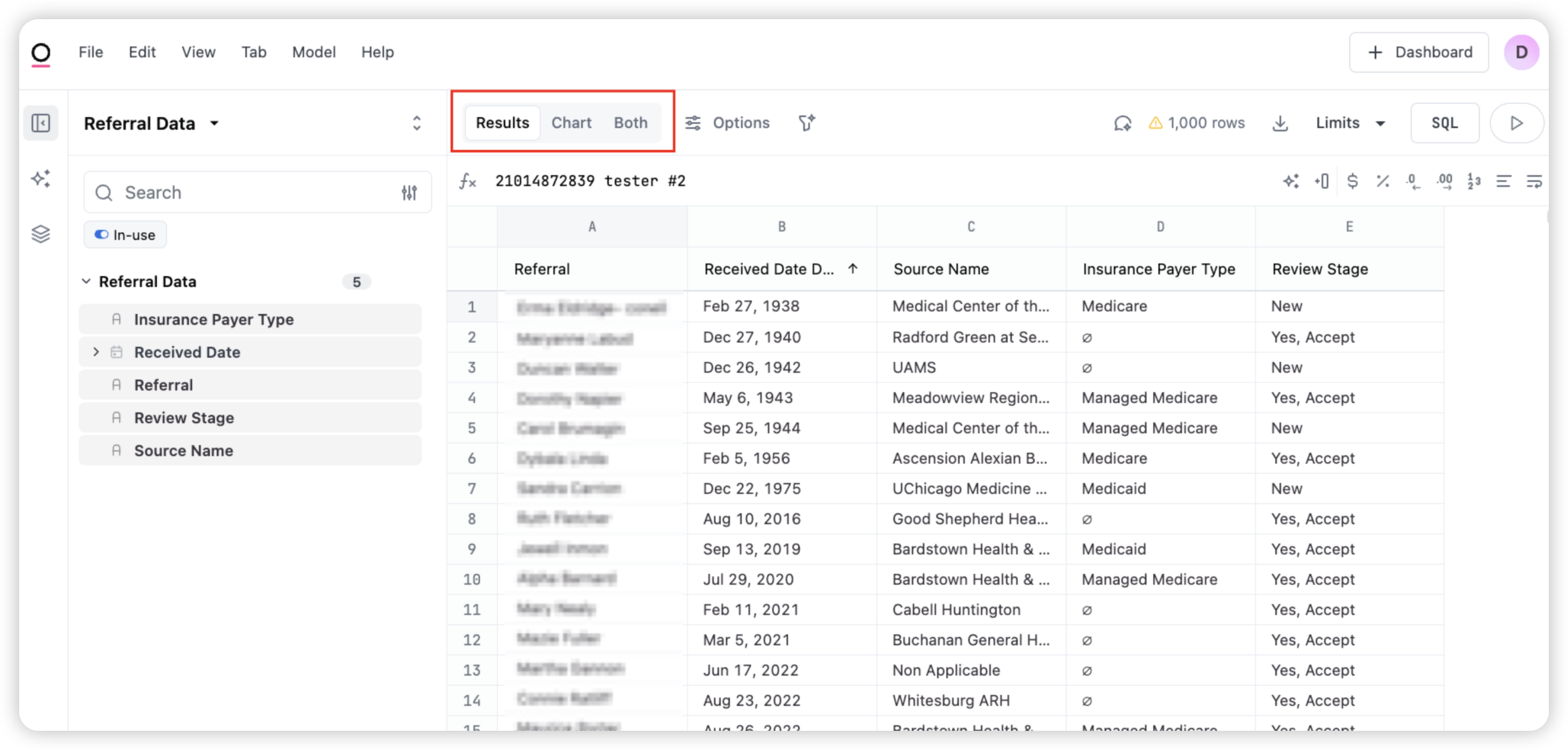
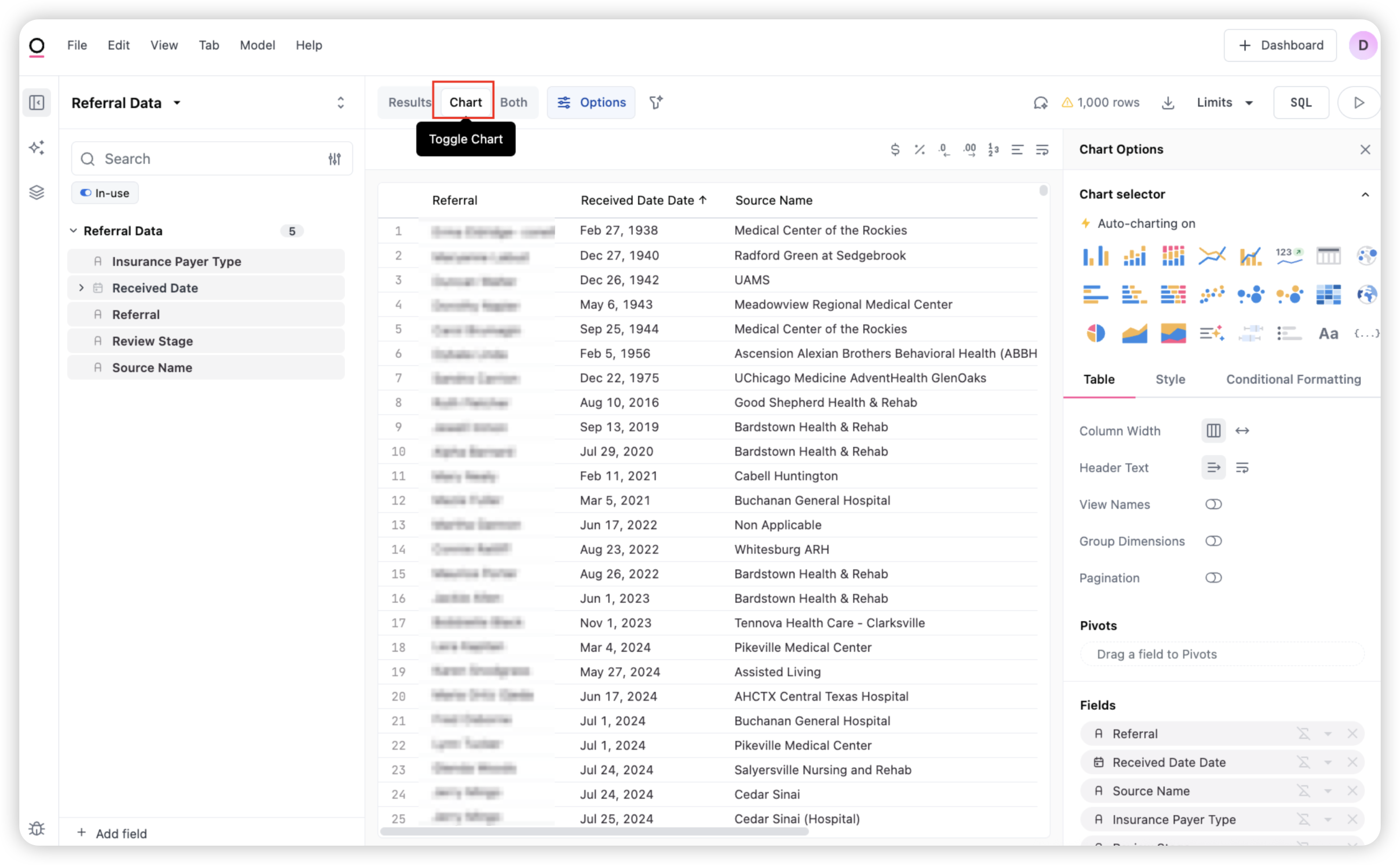
Click the Chart button at the top to toggle to the chart view. This lets you visualize your data.
In this example, we’re keeping the view as a standard table, which is often the clearest way to display detailed row-level referral data. However, you can explore other chart types using the Chart selector on the right-hand panel. You’ll see options like bar, line, scatter, stacked, and more.
Create a new query:
To create a new query, click the plus (+) button in the bottom left corner of your workbook. This opens a new query tab where you can build a separate analysis. Each query you create can be added to your dashboard as a new tile.

Save your query:
Once your chart or table looks the way you want, click the + Dashboard button in the top-right. This moves your visualization into a dashboard layout where you can combine multiple views, add filters, and format it for sharing.

When saving your dashboard, you can:
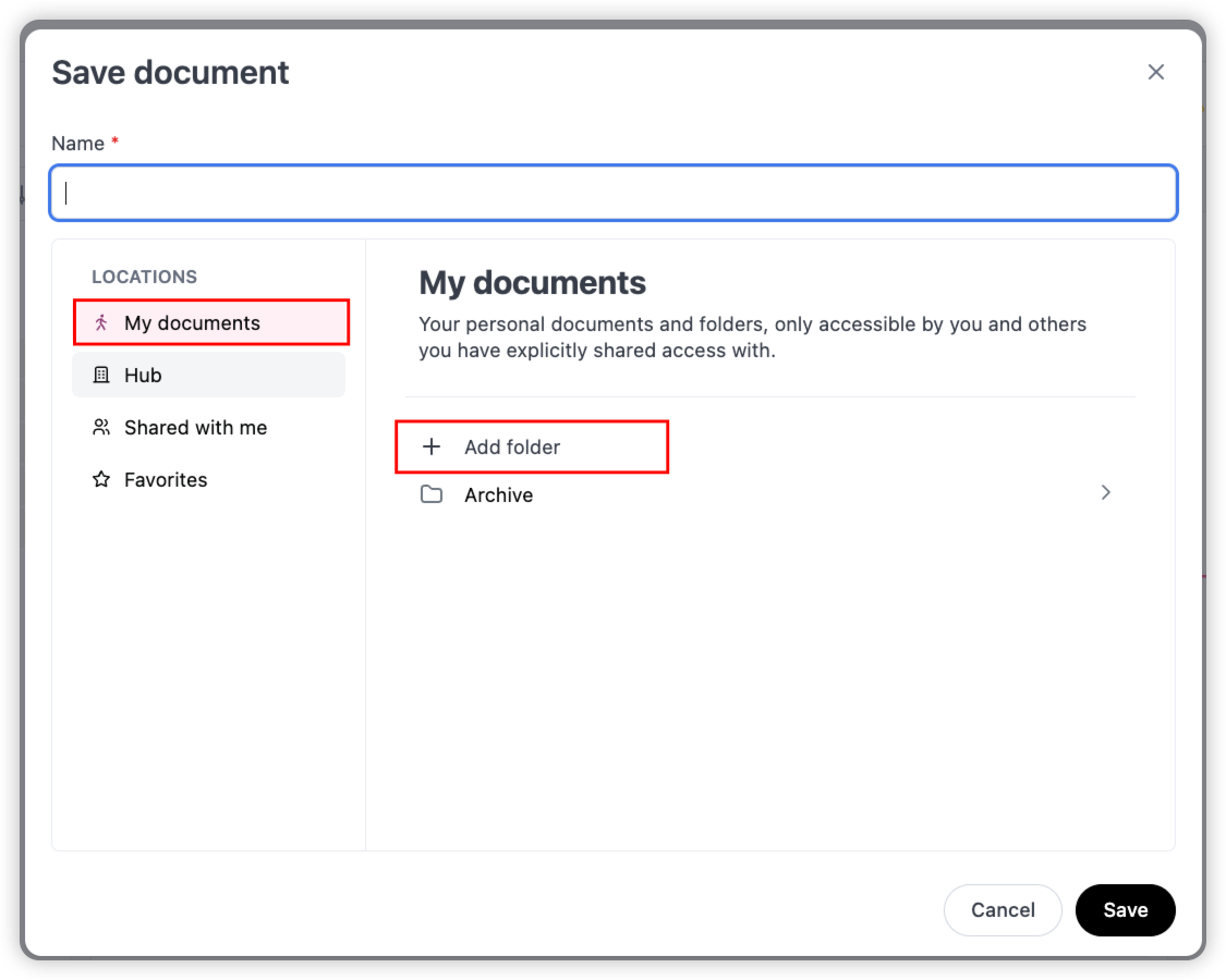
Name the document
Choose where to save it (e.g., My documents or Hub)
Optionally create or select a folder
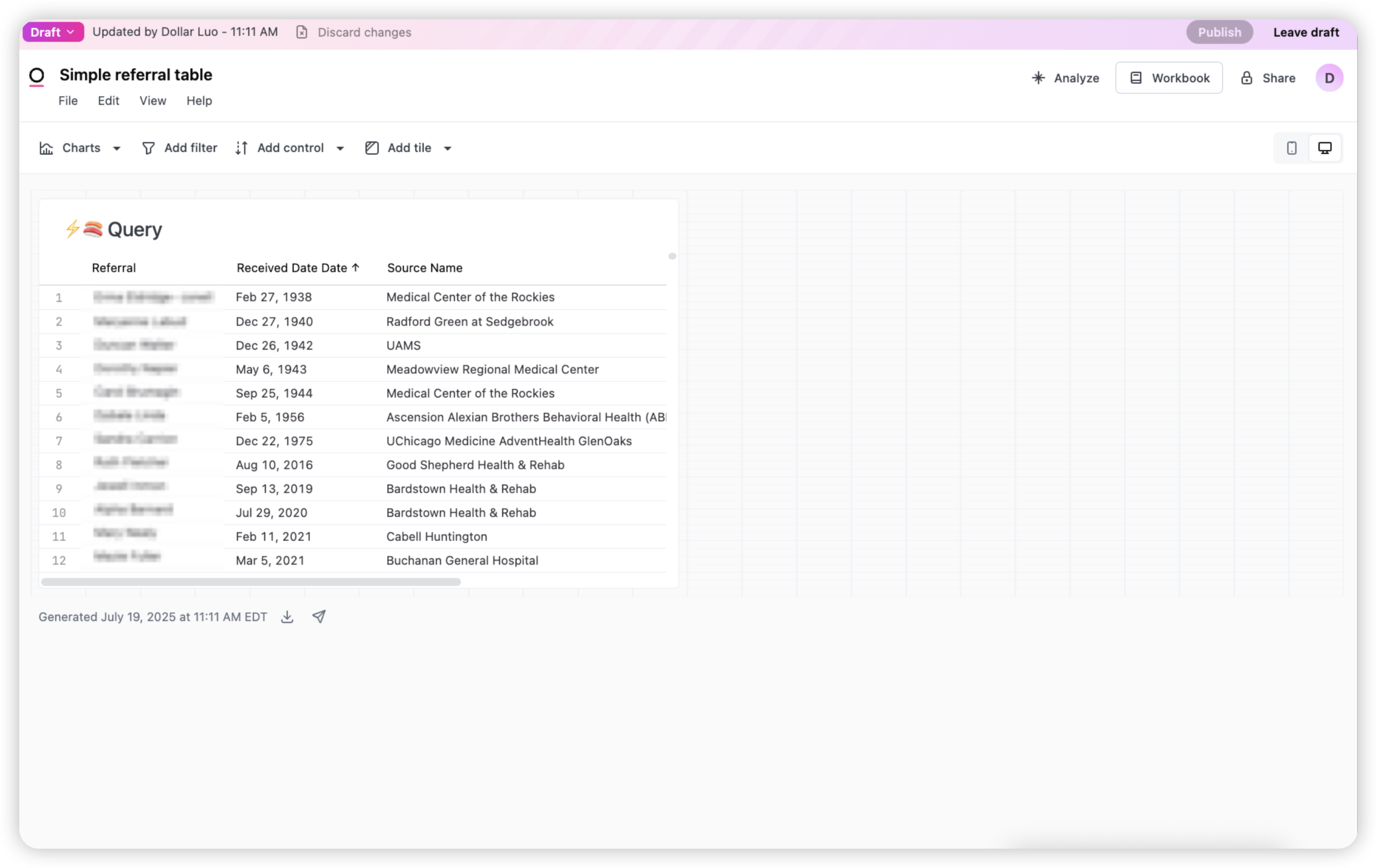
Dashboard View:
This is what your dashboard looks like after saving. Each visualization or table you added from your workbook appears as a tile. In this example, we have a single query showing a referral table.
Resize the tile
You can resize the tile by clicking and dragging its right or bottom edge

Using Filters:
To make your dashboard interactive, click the Add filter button at the top of the page. This allows viewers of your dashboard slice the data based on selected fields.
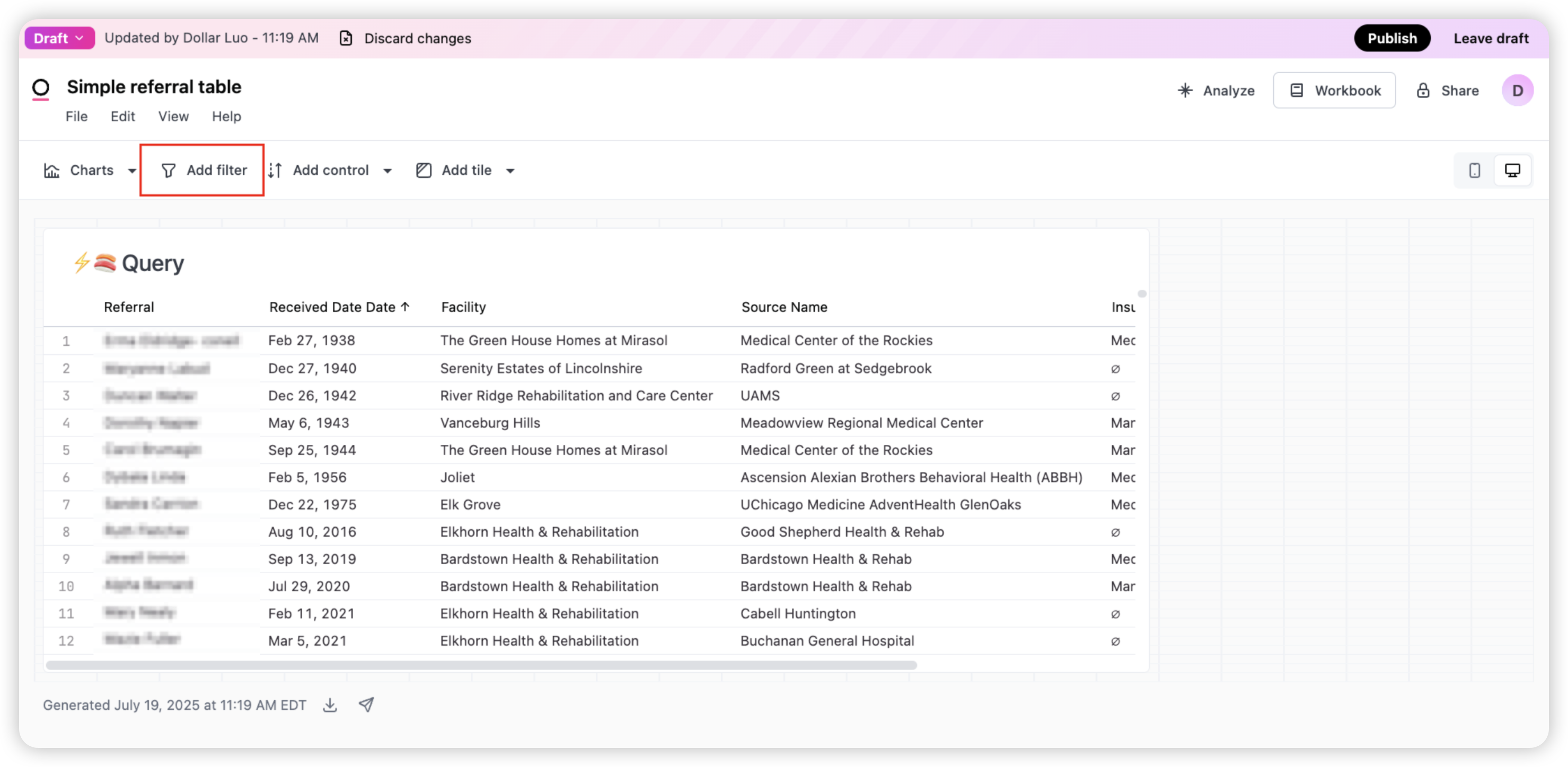
Test Your Learning!
Add a Facility filter to your custom dashboard
This will allow dashboard users to filter the table based on which facility the referral is associated with.
How to:
Click Add Filter
Search for "Facility"
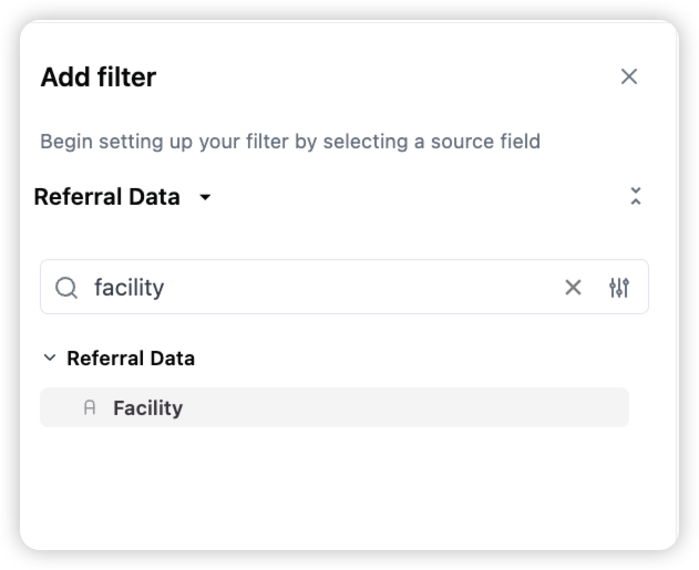
Once added, your Facility filter will appear above the table. Users can now select a facility name to instantly update the table contents.
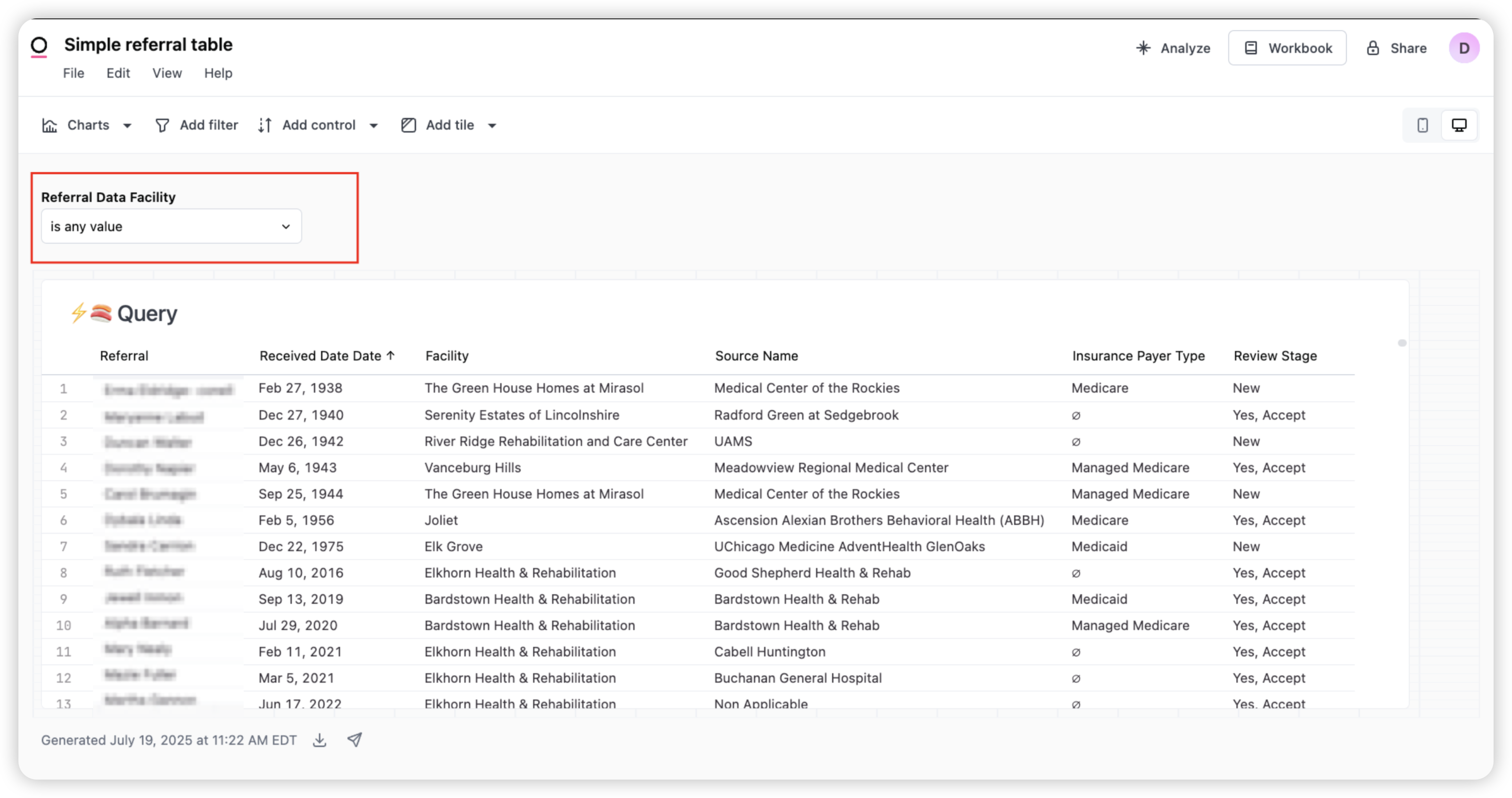
Saving your Report:
Once you’re satisfied with how your dashboard looks and functions, click the Publish button in the top right corner. This saves your changes and makes the dashboard viewable to others, depending on your sharing settings.
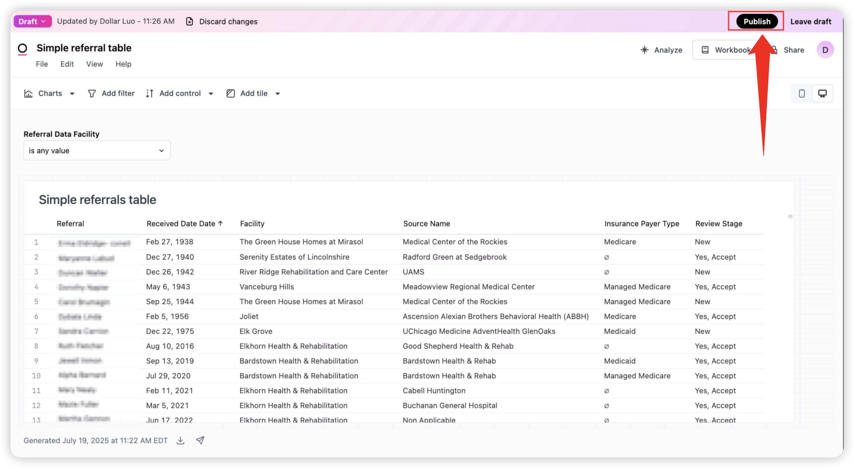
Editing dashboards
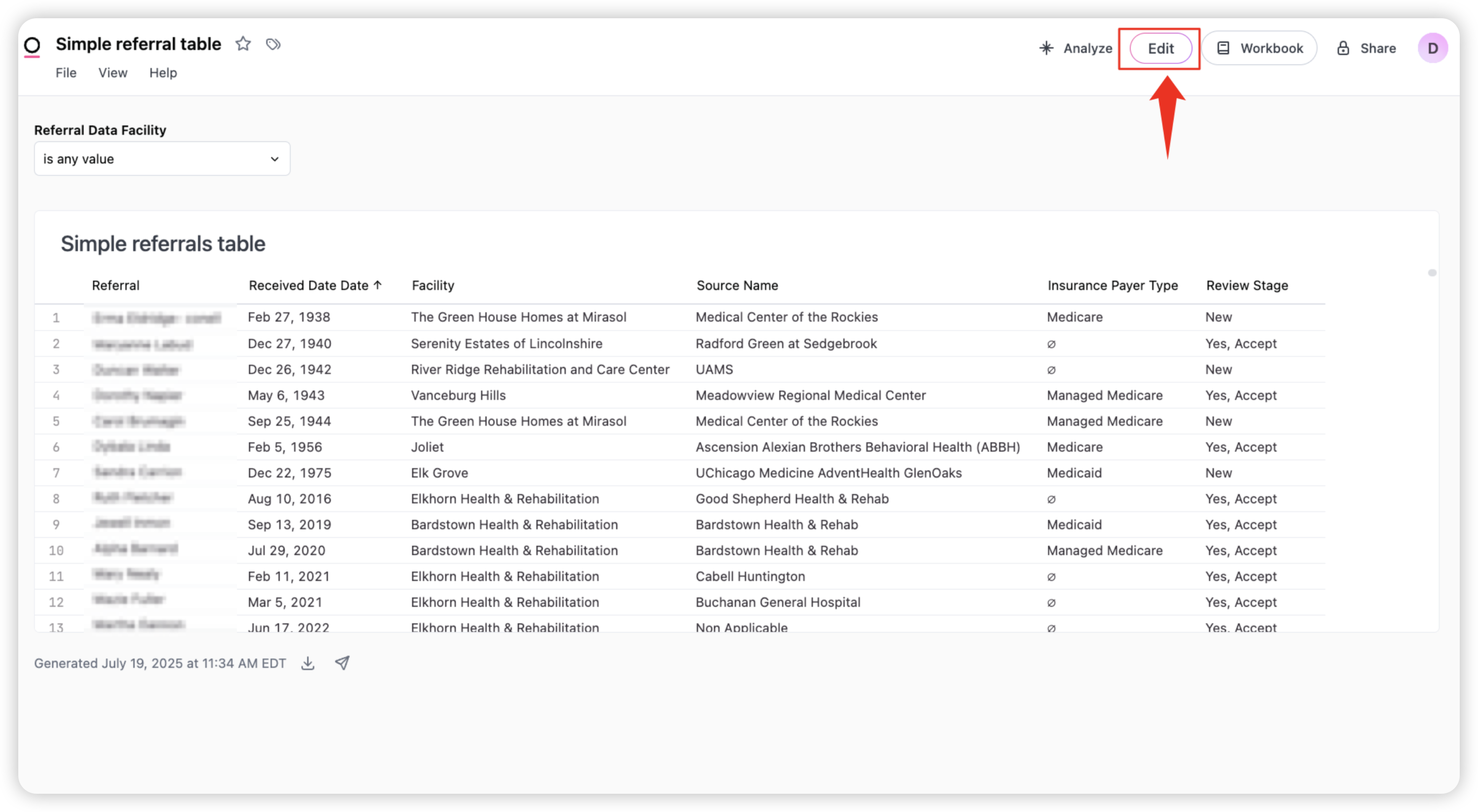
To edit your dashboard, return to it in your documents, click Edit.
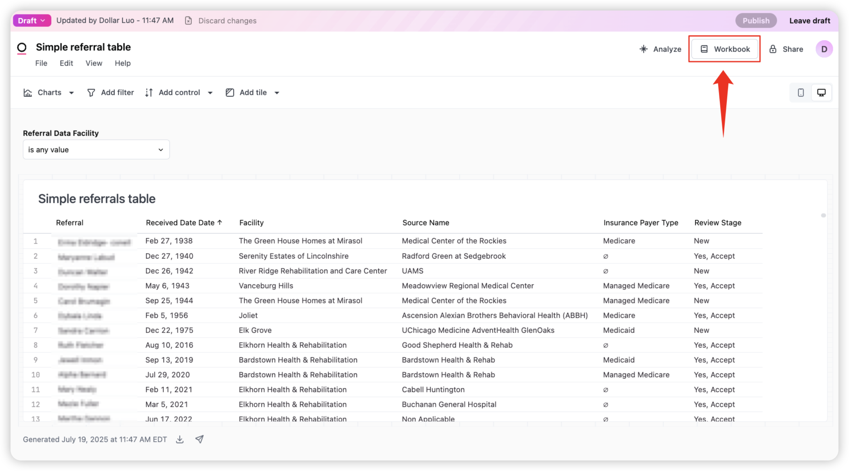
Next select Workbook. Now you’ll be able to adjust queries, resize tiles, add filters, or change visual formatting
Download or Print the Report
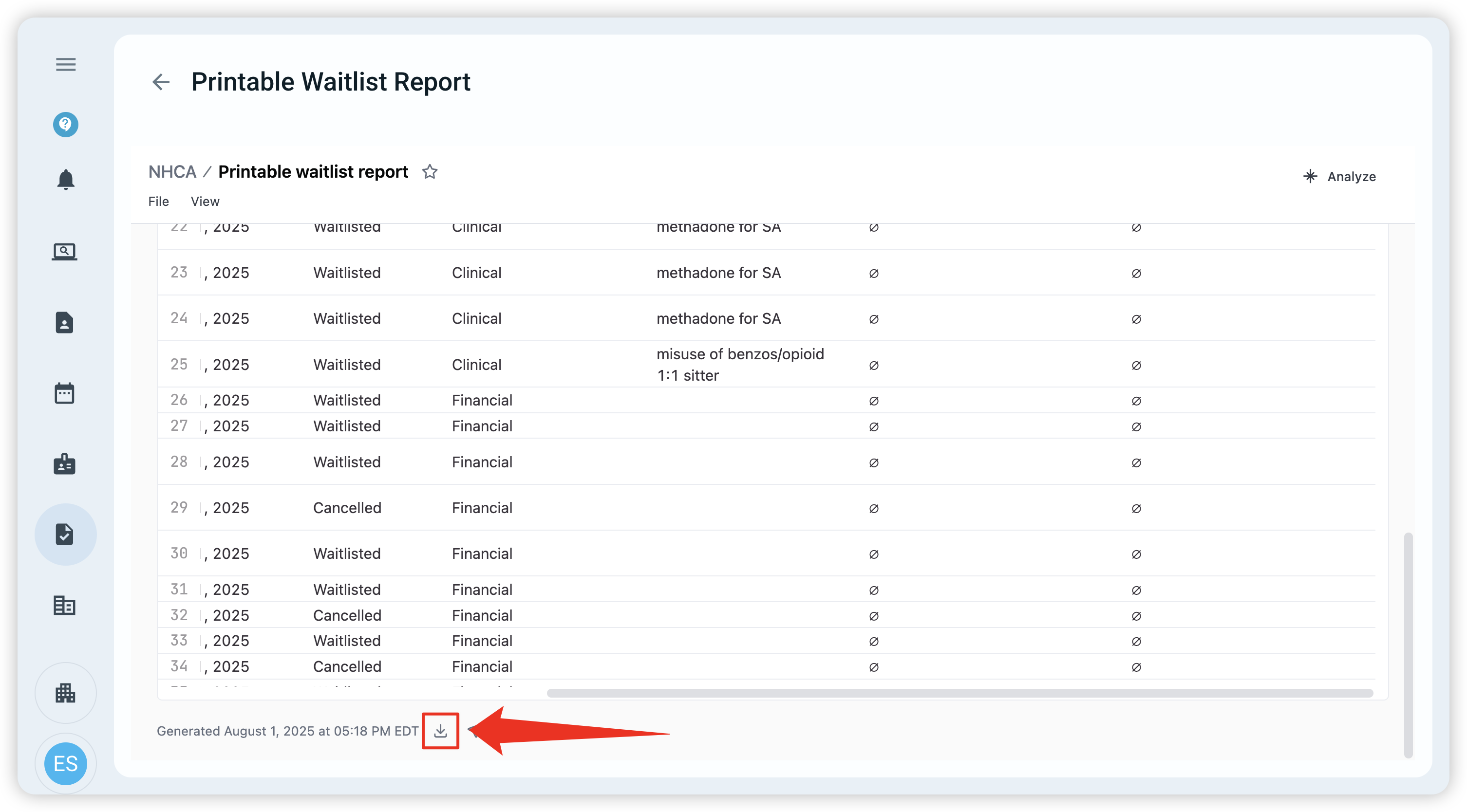
You can download the Printable Waitlist Report in multiple formats such as PDF, Excel, or image. Here’s how:
Scroll to the very bottom of the report and click the download icon
Choose your preferred file format — PNG (image), PDF, Excel (XLSX), or CSV. PDF is recommended for printing
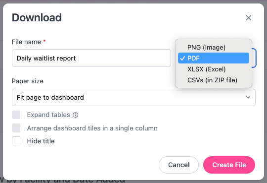
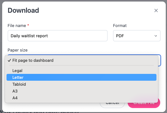
Next, select the paper size. This will determine how the page size for the report
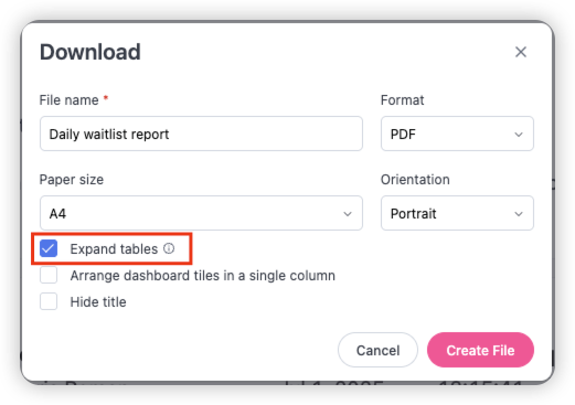
Ensure the Expand tables box is checked so that all tables are expanded to show all rows
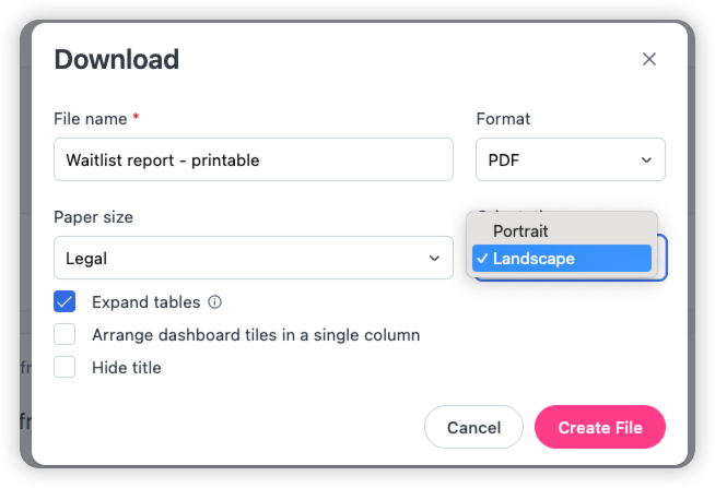
Select Landscape, then Create File
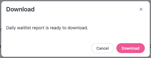
Once the report is created, then select Download to download the report. The report is now ready to be printed
Duplicate and customize existing dashboards
In this video, I walk through the process of duplicating an existing dashboard in the custom report builder so you can create your own editable version.
I demonstrate how to access the Full Referral Dataset Export and save it either in your organization's folder or in My Documents for personal use. After saving, you can make any modifications you wish and publish your changes.
You can also duplicate and save any of the standard dashboards as well, using them as starting points for your own customizations.
Reference guide
This reference guide provides a deeper dive into advanced reporting capabilities using the exacare ai custom report builder. It covers how to navigate and build dashboards, create and refine workbooks, use advanced field options and formulas.
It’s designed for users who want to go beyond the basics, including working with joins, workbook modes, xlookup functions, and promoting calculations to the shared data model.
Google sheets custom report builder reference
View link to watch included videos: